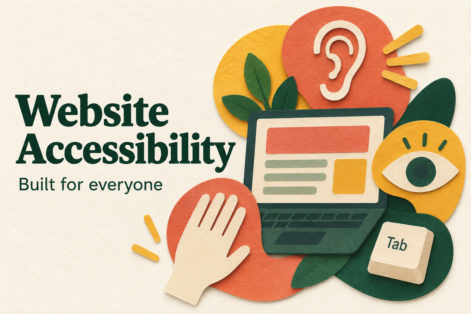
Most business owners think about website accessibility only when a customer complains, or when a lawyer’s letter shows up. By then it feels like a big, expensive problem. It usually isn’t. Website accessibility is mostly a set of small, sensible habits that make your site easier for everyone to use, including people who browse with a screen reader, a keyboard, or just a cracked phone screen in bright sunlight.
This guide covers what accessibility actually means, what Canadian businesses should know, and a checklist you can work through without becoming a developer.
What website accessibility really means
Website accessibility means people with disabilities can perceive, understand, and use your site. That includes visitors who are blind or have low vision, people who are deaf or hard of hearing, people with motor difficulties who can’t use a mouse, and people with cognitive differences who need clear, predictable layouts.
The international standard most people follow is the Web Content Accessibility Guidelines (WCAG). It is built on four ideas: content should be perceivable, operable, understandable, and robust. Every specific rule sits under one of those four.
Here’s the part that gets overlooked. Accessible sites are also better sites. Clear headings, readable text, and fast, predictable navigation help every visitor and they help search engines too.
Why Canadian businesses should care
There are three practical reasons.
- Your customer base is bigger than you think. A meaningful share of Canadians live with some kind of disability, and many more have temporary or situational limits, like a broken wrist or a noisy train.
- Legal expectations exist. Ontario’s AODA and the federal Accessible Canada Act set requirements for certain organizations. Whether they apply to you depends on your size, sector, and location, so it’s worth confirming with a legal advisor rather than guessing.
- It protects your brand and your conversions. A checkout your customer can’t complete is a lost sale, whether the cause is a disability or a badly labelled form field.
A practical website accessibility checklist
You don’t need to fix everything in one weekend. Start with the issues that block the most people.
1. Check your colour contrast
Light grey text on a white background looks elegant in a mockup and is unreadable in real life. WCAG asks for a contrast ratio of at least 4.5:1 for normal text. Free contrast checkers will test your brand colours in seconds.
2. Add alt text to meaningful images
Alt text describes an image for people who can’t see it. Keep it short and specific. “Owner measuring a window for a quote” beats “image1.jpg”. Purely decorative images can have empty alt text so screen readers skip them.
3. Make sure everything works with a keyboard
Put your mouse aside and try to navigate your site with the Tab key. Can you reach the menu, open the dropdowns, fill in the contact form, and submit it? Is it obvious where the focus is? If you get stuck, so do some of your visitors.
4. Use real headings in the right order
Screen reader users often jump from heading to heading to scan a page. Use one H1, then H2s for main sections and H3s beneath them. Don’t pick heading levels just because of how big the text looks.
5. Label every form field
Placeholder text disappears the moment someone types. Give each field a visible label and write error messages that explain how to fix the problem, not just that something went wrong.
6. Write link text that makes sense alone
“Click here” tells a screen reader user nothing. “Download our pricing guide” does.
7. Caption your videos
Captions help deaf and hard of hearing visitors, and they help everyone watching with the sound off, which is most people on mobile.
How to test website accessibility yourself
You don’t need expensive software to get a first read on your website accessibility. A free afternoon and a few tools will surface most of the obvious problems.
Run an automated scan
Free tools like WAVE and the Lighthouse report built into Chrome will flag missing alt text, low contrast, empty links, and unlabelled form fields. Treat the results as a to-do list, not a verdict. Automated scans catch only a portion of real issues, so a clean report doesn’t mean a clean site.
Try a screen reader for ten minutes
Every Mac and iPhone ships with VoiceOver, and NVDA is a free screen reader for Windows. Turn one on and try to find your phone number and book a service without looking at the screen. It’s humbling. You’ll quickly hear which images have useless descriptions, which buttons just say “button”, and which pages have no clear structure.
Zoom to 200 percent
Many people with low vision simply enlarge the page. Press Ctrl and the plus key until the page is twice its normal size. Does text overlap? Does the menu vanish? Do you have to scroll sideways to read a sentence? Layouts that fall apart when zoomed are one of the most common website accessibility failures we find.
Ask real users
If you can, ask a customer or a local advocacy group to try your site with the assistive technology they use every day. Ten minutes of honest feedback is worth more than a hundred automated warnings.
Common website accessibility mistakes on small business sites
After reviewing a lot of Canadian small business websites, we see the same handful of problems again and again.
- Sliders that move on their own. Auto-rotating banners are hard to read, hard to pause, and distracting for people with attention or vestibular conditions. A single strong hero image usually converts better anyway.
- Important information locked in PDFs or images. A menu, price list, or event poster uploaded as a picture is invisible to a screen reader. Put the text on the page.
- Tiny tap targets on mobile. Links crammed close together are frustrating for anyone with shaky hands, and for anyone using a phone on a bumpy bus.
- Colour as the only signal. “Required fields are in red” doesn’t help someone who is colour blind. Add an asterisk or the word “required”.
- Pop-ups that trap people. A newsletter pop-up with no keyboard-friendly close button can block a visitor completely.
- Missing page language. If the language isn’t declared in the code, screen readers may read your content with the wrong pronunciation. For bilingual Canadian businesses, French pages need to be marked as French too.
Most of these fixes are quick once someone knows to look for them.
Website accessibility and SEO go hand in hand
Search engines can’t see images or watch videos the way people do. They read structure and text, much like a screen reader does. That’s why so much website accessibility work doubles as SEO work. Descriptive alt text helps your images show up in image search. A logical heading structure helps Google understand what each page is about. Captions and transcripts give search engines more text to index. Clear link text tells both people and crawlers where a link goes. Fast, stable pages help people on older phones and slow rural connections, and they help your Core Web Vitals too. When you improve website accessibility, you’re usually improving your rankings at the same time.
What does it cost to improve website accessibility?
It depends on where you’re starting. On a modern, well-built site, a first round of fixes often comes down to a few hours of content and design tweaks: better alt text, stronger contrast, clearer labels, and some small code changes. Older sites built on heavy themes can take longer, especially if menus and forms need to be rebuilt. The most expensive path is ignoring website accessibility until a complaint forces a rushed fix. Budgeting a little every quarter keeps the work manageable. If you’re comparing quotes for a rebuild, our web development cost guide for Canada explains what drives pricing.
Website accessibility FAQ
Is my small business legally required to have an accessible website?
It depends on your province, your size, and your sector. Ontario’s AODA has specific website rules for many organizations, and federally regulated businesses fall under the Accessible Canada Act. Other provinces are working on their own rules. When in doubt, ask a lawyer, but building to WCAG 2.1 Level AA is a sensible target for everyone.
How often should I review website accessibility?
Check your key pages every quarter and any time you launch a new page, form, or feature. New content is where old problems sneak back in.
Can I fix website accessibility on my own?
Many content fixes, like alt text, headings, and link wording, you can handle yourself in WordPress or Shopify. Keyboard navigation, focus states, and form code usually need a developer.
Where accessibility overlays fall short
You’ll see plenty of plugins promising instant compliance with one line of code. Be cautious. Automated tools can catch some problems, but they can’t judge whether your alt text is meaningful or your page makes sense read aloud. Real website accessibility comes from how the site is designed and built, then tested by actual humans using assistive technology.
Build it in from the start
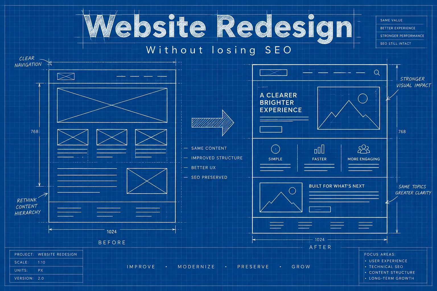
Retrofitting is always more expensive than building it right. If you’re planning a new site or a redesign, ask your developer how accessibility fits into the process. It should show up in the design stage, the code, and the final testing. Our website development team builds these basics into every project, and our guide on what you need to make a website in 2026 shows where they fit in the bigger picture.
A simple way to start this week
Pick your five most important pages: home, your main service, contact, pricing, and checkout or booking. Run through the checklist above on each one. Fix what you find, note what needs a developer, and repeat every few months. Small, steady improvements beat one big panic project.
Not sure how accessible your site is today?
We’ll review your key pages, point out the issues that matter most, and tell you what to fix first. No jargon, no obligation.