
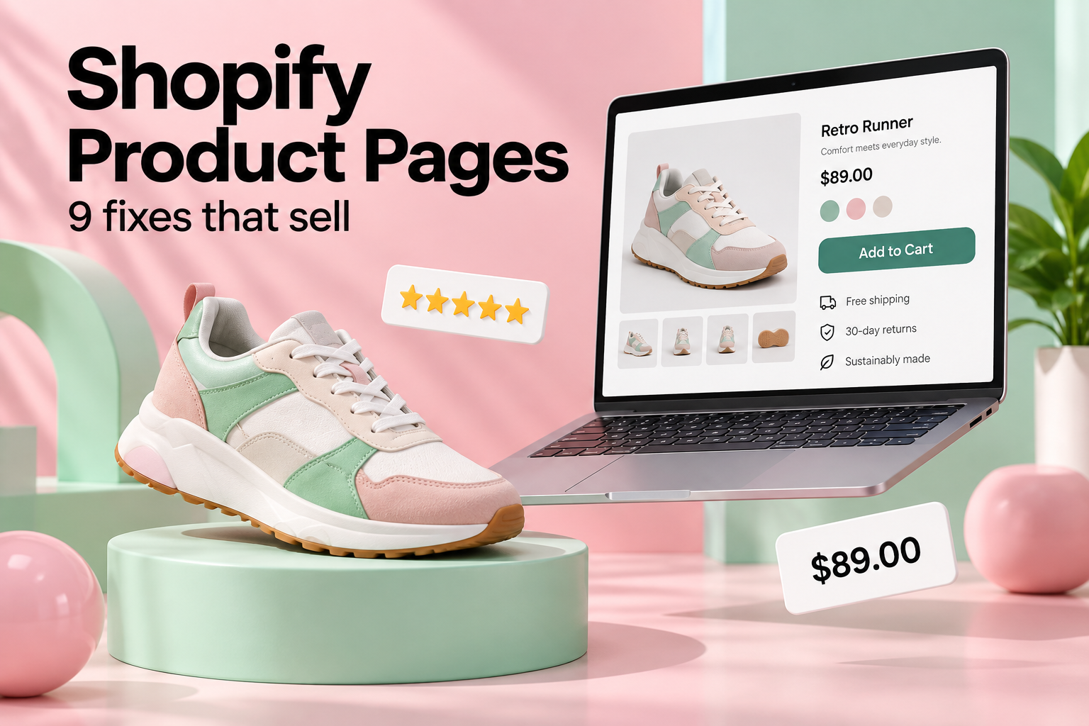
You can spend thousands on ads and still watch shoppers leave without buying. When that happens, the problem is rarely the traffic. It’s the page they landed on. Shopify product page optimization is the quiet, unglamorous work that decides whether a visit turns into an order, and it’s often the cheapest growth lever a store has.
Here are nine fixes we come back to again and again when we build and tune stores for Canadian brands.
Why Shopify product page optimization matters
A Shopify product page does the job of a salesperson. It has to answer questions, calm doubts, and make buying feel safe, all without anyone to talk to. If a shopper can’t quickly tell what the product is, what it costs including shipping, and what happens if it doesn’t work out, they’ll go back to search results. A small lift in conversion rate is worth more than a big lift in traffic, because you keep the extra revenue without paying for more clicks.
9 fixes for a Shopify product page that sells
1. Lead with better photos
Photos are your handshake. Show the product from several angles, in use, and next to something that shows scale. Add at least one lifestyle image and, if you can, a short video. Crop consistently so your grid looks tidy. Compress images before uploading so they load quickly, since a slow page loses people before they’ve seen a single photo.
2. Write a headline that says what it is
Clever names are fine, but pair them with a plain description. “The Cedar Cabin Candle” needs “Hand-poured soy candle, 40 hour burn” nearby. Shoppers scan. Give them the answer in a glance.
3. Describe benefits, then details
Start with what the product does for the buyer, then give the specs. Use short paragraphs and a few bullet points. Write like you’d explain it to a friend at the counter, not like a supplier catalogue.
4. Show the full price and shipping early
Surprise costs at checkout are one of the most common reasons carts get abandoned. If shipping is free over a certain amount, say so on the product page. For Canadian stores, be clear about duties on cross-border orders, and show prices in CAD.
5. Put trust signals near the buy button
Reviews, a return policy summary, secure payment icons, and delivery times all belong close to the button. Real customer photos are more persuasive than polished ones. If you have no reviews yet, offer a small incentive to your first buyers and follow up by email.
6. Keep variant selection simple
Size and colour pickers should be obvious, and the selected option should change the main photo. Mark out-of-stock variants clearly instead of letting people click into a dead end.
7. Make the button impossible to miss
One primary button, in a colour that stands out from the rest of the page, with plain text like “Add to cart”. On phones, consider a sticky button that stays visible as people scroll. Most Shopify traffic is on mobile, so check your page on a real phone, not just a resized browser window.
8. Answer objections with a short FAQ
Look at the questions your support inbox gets most. Sizing? Care instructions? Delivery to the Prairies? Put those answers right on the Shopify product page. Every question you answer in advance is one fewer reason to leave.
9. Suggest the right add-ons
Related products and bundles can raise your order value, but only when they make sense. A phone case suggested next to a phone helps. Random best sellers just add clutter. For more ideas, see our list of free apps that raise average order value.
What a high-converting Shopify product page looks like
It helps to picture the page from top to bottom, the way a shopper actually experiences it on a phone.
- Above the fold: a sharp main photo, the product name with a plain description, the price in CAD, a short line about shipping, and the add-to-cart button. If someone reads nothing else, they should still know what they’re buying.
- Just below: variant options, a star rating with a review count, and two or three bullet points covering the biggest benefits.
- The middle: the full description, sizing or spec details, and more photos or a short video showing the product in use.
- Further down: reviews with customer photos, a short FAQ, and your return policy in plain words.
- The bottom: related products or a bundle offer, so people who aren’t ready yet have somewhere useful to go.
Every Shopify product page doesn’t need every element. A $12 accessory needs less convincing than a $900 appliance. But this order matches how most people make a buying decision: quick facts first, reassurance second, details for those who want them.
Shopify product page SEO basics
Conversion and search visibility overlap more than most store owners expect. A few habits make each Shopify product page easier to find as well as easier to buy from.
Write unique descriptions
Copying the manufacturer’s description means your page says the same thing as dozens of other stores. Google has little reason to rank yours. Rewrite it in your own words and add details only you know, like how it fits or what customers say about it.
Edit the search listing
At the bottom of each product in the Shopify admin, you can edit the page title, meta description, and URL handle. Keep the title under about 60 characters, lead with what the product is, and write a description that gives people a reason to click.
Name and describe your images
Rename files before uploading, so “IMG_4432.jpg” becomes “merino-wool-toque-charcoal.jpg”, and add alt text that describes the photo. It helps shoppers using screen readers, and it helps your products appear in image search.
Watch for duplicate pages
The same product can be reachable through several collection URLs. Shopify handles canonical tags for you on most themes, but custom themes and some apps can break this. It’s worth checking during any theme change.
Mobile first: how shoppers really see your Shopify product page
For most Canadian stores we work with, well over half of all visits come from phones. That changes priorities. Long paragraphs feel even longer on a small screen, so break them up. Tabs and accordions keep specs and shipping details tidy without hiding them completely. Buttons need to be big enough for a thumb. Pop-ups that cover the whole screen within seconds of arriving are a fast way to lose people. Open your own Shopify product page on your phone, over mobile data rather than Wi-Fi, and try to buy something. You’ll spot friction right away.
Common Shopify product page mistakes
- Too many apps. Each review widget, timer, and upsell tool adds code. Five apps doing small jobs can slow a page more than a big image.
- Fake urgency. Countdown timers that reset on every visit damage trust once people notice, and they do notice.
- Hidden return policy. If the policy is only in the footer, many shoppers won’t find it before they give up.
- No reviews at all. An empty review section can look worse than none. Collect reviews early, even if it means emailing your first customers personally.
- One photo on white. It works for some products, but most need context, scale, and detail shots.
Shopify product page FAQ
How long should a product description be?
Long enough to answer the questions buyers actually ask. For simple products that might be 150 words. For considered purchases, 400 words or more is common, split into short sections.
How many images should a Shopify product page have?
Most stores do well with five to eight: a clean main shot, a few angles, a close-up of details, one or two lifestyle photos, and a scale reference.
Do I need a page builder app?
Not usually. Most modern Shopify themes let you rearrange product page sections without extra apps. A builder can help for special launch pages, but it’s one more thing to load and maintain.
Don’t forget speed and structure
Great copy can’t rescue a slow page. Too many apps, oversized images, and heavy themes are the usual culprits. Shopify’s own theme best practices are a good place to start when you audit your store. Search engines also read every Shopify product page, so give each one a unique title, a proper description, and clean headings. That’s the overlap between conversion work and SEO, and it’s why we treat them as one project.
How to test without guessing
Change one thing at a time and give it enough traffic to mean something. Swap the main image, rewrite the first bullet, move the reviews higher, then compare the add-to-cart rate over a couple of weeks. Keep notes on what worked. Over a few months those small wins add up to a noticeably better store.
If you’d rather have a team handle the heavy lifting, our Shopify and e-commerce service covers store builds, theme customization, and conversion work. Comparing platforms first? Our breakdown of WordPress vs Shopify vs Squarespace might help.
Want your product pages to convert better?
Tell us about your store and we’ll point out the quickest wins on your best sellers, free of charge.


One Response